Project Case Study
Journee Overview
A trip planner that doubles as a slideshow. Keep hotels, places and a day-by-day plan in one place, then walk the people you're travelling with through the options instead of sending them a pile of links.
Framework
next
Route
/apps/journee
Status
ongoing
Each trip is split into sections — where to stay, what to see, and the plan for each day. Any section can be browsed like a normal app while you're planning, or played as a slideshow when you want to show it to someone, so nothing has to be rebuilt to share it.
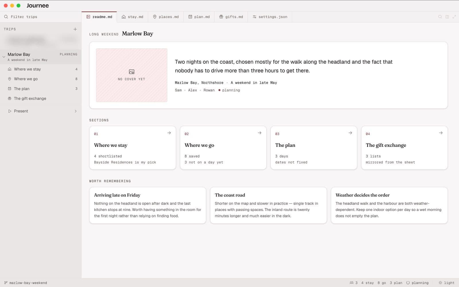
Workspace + Sidebar
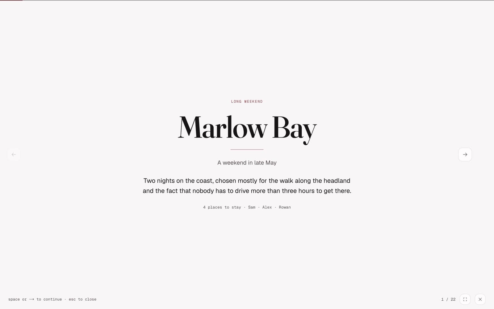
Presentation Deck
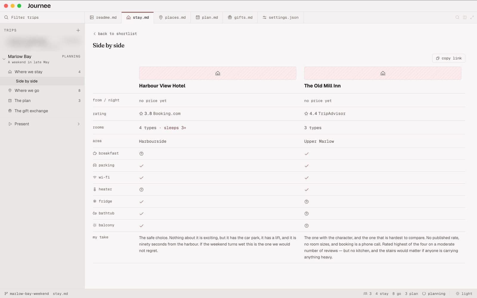
Stay Comparison
Challenge Statement
When you plan a trip with someone, one person usually does all the research and the other has to catch up. I'd end up with a dozen browser tabs and a chat full of links, and when it was finally time to pick a hotel, nobody could see the options next to each other. Rebuilding everything as a slideshow just to have that conversation meant doing the work twice.
A planning tool isn't more useful for having more fields. It's useful when it can answer "so, which one?" on a single screen, for someone who hasn't read any of the research.
- The same trip data works two ways — an editor-style workspace while you plan, a slideshow when you show it to someone.
- Recommendations are derived, not hardcoded — each option is scored against that trip's stated priorities, and the priority list is printed on screen, so a wrong recommendation is visible rather than silent.
- Comparisons show what an option lacks as well as what it has, because listing only the wins lets a reader assume the rest.
- Light, dark and system themes, resolved before first paint so a pinned theme never flashes the wrong one on reload.
Solution Approach
Built two views over the same trip data: an editor-style workspace for planning, and a slideshow for showing it to someone. The slideshow moves two ways — left and right between options, down into a hotel's rooms or reviews and back up again — so you can answer a question mid-presentation without losing your place.
- Sections are declared per trip and drive the sidebar, tabs and routes together, so a trip without a section has no empty page waiting for it.
- The slideshow moves in two directions — left and right between options, down into an option's detail and back up — so looking something up mid-presentation never takes you out of the slideshow, and there is nothing to find your way back from.
- Lists are read from a published Google Sheet at request time, so the content stays editable by someone who will never open the repository.
- The landing page is structurally incapable of showing trip data: it lives in a separate route group, so nothing leaks through serialised props.
Technologies Stack
- Next.js — Framework — route groups keep trip data off the landing page entirely
- React — UI — the workspace shell, the slideshow, and the section components they share
- TypeScript — Language — trips are typed, so a section a trip never declares cannot render
- Tailwind CSS — Styling — a token-only palette, which made recoloring the whole app a one-file change
- Google Sheets API — Data — lists are read from a published sheet, so they update without a deploy
- Vercel — Hosting — production deployment on a custom domain